Like if you want using the keys below; only I can see who you are.
This article includes information and a graphic from History Today Magazine August 2023.
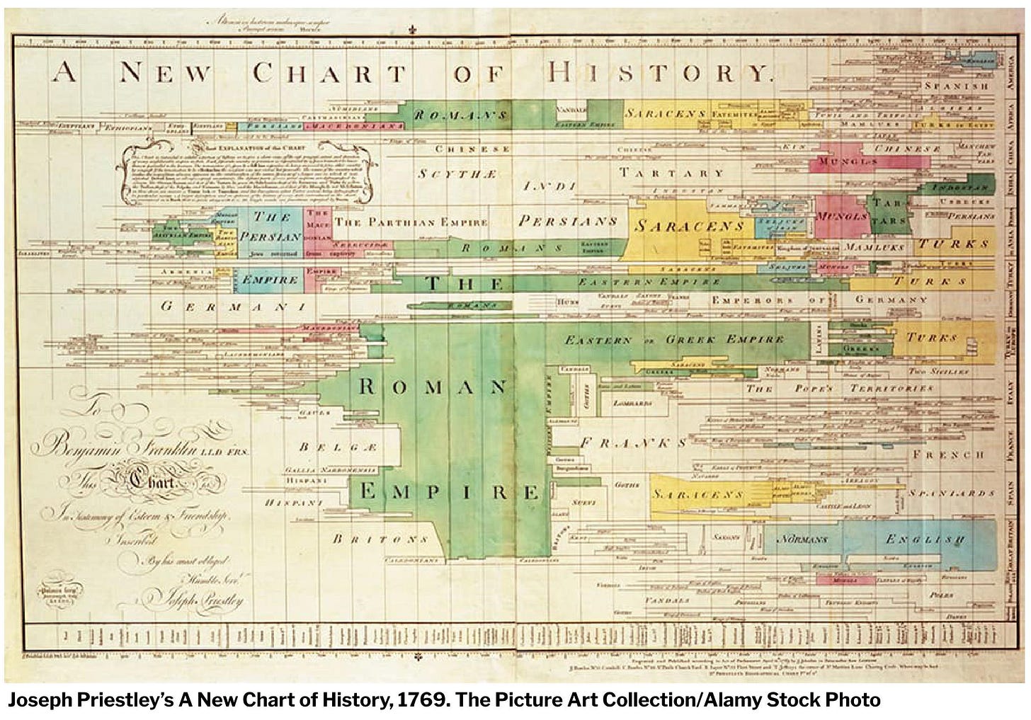
When we say “time” these days, we all know what’s meant: look at a clock, a calender, a phone…but it wasn’t always that way. The flow of time—years, in this case—didn’t have a good image until Joseph Priestly made his Chart of Biography while he was a minister at Mill Chapel in Leeds, England:
This was the same Joseph Priestly who discovered oxygen in 1774. Like many men of learning, Priestly’s wandering mind went into optics, chemistry, theology, and even grammar. The chart above, something we’ll take in our stride, was a whole new way to look at the past: as happening in several places at once and having a different influence in different locations.
It really was something.
Along the right edge are the locations, from America through to Great Britain. (Sorry if graphic quality prevents my readers from seeing it clearly…it does me, too.) The Roman Empire (in green) was influential in the Mediterranean world (appropriately dominating the middle of the graphic) for a much greater period than it was in Great Britain (towards the bottom) and had no influence at all on the Americas (top). It also had some in Africa and the Middle East (below America), none in China or India (between Africa and the Mediterranean), and only a little in central Europe.
This was a new way to think of the past.
It was so new it came with a book to explain it. A Description of a Chart of Biography sought to justify representing times using lines:
As no image can be formed of abstract ideas, they are, of necessity, represented in our minds by particular, but variable ideas ... THUS the abstract idea of TIME...admits of a natural and easy representation in our minds by the idea of a measurable space, and particularly that of a line; which, like time, may be extended in length, without giving any idea of breadth or thickness.
There had been other graphics representing the span of time, including Thomas Jeffries’ 1753 A Chart of Universal History, but Priestly used some 2,000 characters to show something like two millennia. It was so popular that it ran at least 19 editions in England, the United States (it was one of the first acquisitions for the Library of Congress), the Netherlands and Italy. He wrote another book in the same year, A New Chart of History, writing:
It is even easy to show ... that wars, revolutions of empire, and the necessary consequences of them, have been, upon the whole, extremely favourable to the progress of knowledge, virtue, and happiness.
Of necessity, Priestly, living in Georgian England, was Eurocentric, seeing pretty much everything through a lens of a certain supremacy of European ideas whether or not there was a recognizable “Europe.” In that, some 20th Century commentators have criticized this graphic and others as being “too white.” However, there were many imitators of the concept in his time, and there still are. By the time of Priestly’s death in 1804, timelines abounded, and today everyone uses one or two. For the invention of a graphic representation of history, we can thank the co-discoverer of oxygen.
JDBCOM in World At War
For those of you who read this Decision Games magazine, #33, the December 2023-January 2024 issue, contains my article, “Soviet Casualties, 1941-45.” It’s not very long, but I add fuel to the fires of the debate of “more miserable than thou” that surrounds the body counts of the Soviet Union and China in WWII by arguing that we cannot ever really know how many Soviet casualties there were because, among other things, we don’t know how many Soviets there were to start with…and neither did they. It should be on your local bookseller’s shelf by now.
The Past Not Taken: Three Novellas
The Past Not Taken is also a new way to look at the past: from the standpoint of how it’s written.
A young man is confronted with three different dilemmas regarding the past, and realizes that the way he thought it was supposed to be written is a far cry from the way it is written. Available from your favorite bookseller or from me if you want an autograph.
Coming Up…
A Year In Review
The Cantankerous Machine That Won The War.
And Finally…
On 23 December:
1823: “Account of a Visit From St. Nicholas” attributed to Clement Clark Moore first appears in the Troy, New York Sentinel. Better known as “The Night Before Christmas,” and “‘Twas the Night Before Christmas” for its first line, the poem is chiefly responsible for the imagery of Santa Claus (a name derived from the Dutch Sinterklaas) now seen in the West.
1941: The fighting on Wake Island begins and ends. After a series of air attacks beginning on 8 December and repelling an attack on 11 December, the small garrison of less than 500 military personnel and over a thousand civilians surrendered to the attacking Japanese after a furious, all-day amphibious assault.
And 23 December is FESTIVUS, a secular holiday conceived by Reader’s Digest author and editor Daniel O’Keefe, and meant to be a joyous feast day celebrated as early as 1966. Yes, it was later shown on Seinfeld, but I never watched that.


